THE MAKING OF IN THE UNLIKELY EVENT
Keynote lecture delivered at the 2015 AAAE Arts in the Airport workshop.
In summer 2013 I took it upon myself to build the world’s 30 busiest International Airports by hand.
In terracotta.
At the exact same scale.
You might be wondering: why would a person attempt to do such a thing?
* * *
I’ve had a kind of obsession with air travel for some time.
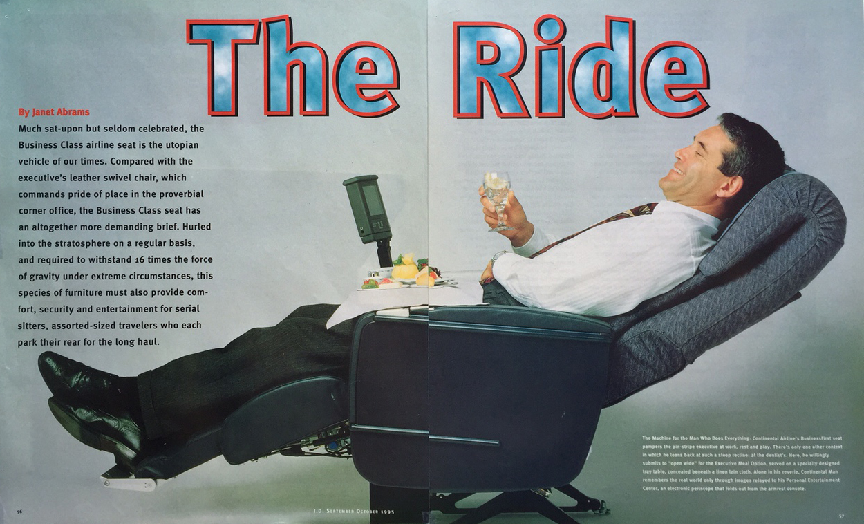
I wrote an essay on airport design for the catalog of the 2002 Venice Architecture Biennale entitled “Wherever. Your Final Destination. Maybe”, and before that, a lengthy feature, "The Ride" on the design and symbolism of Business Class Airline Seats for I.D. International Design Magazine in 1995.
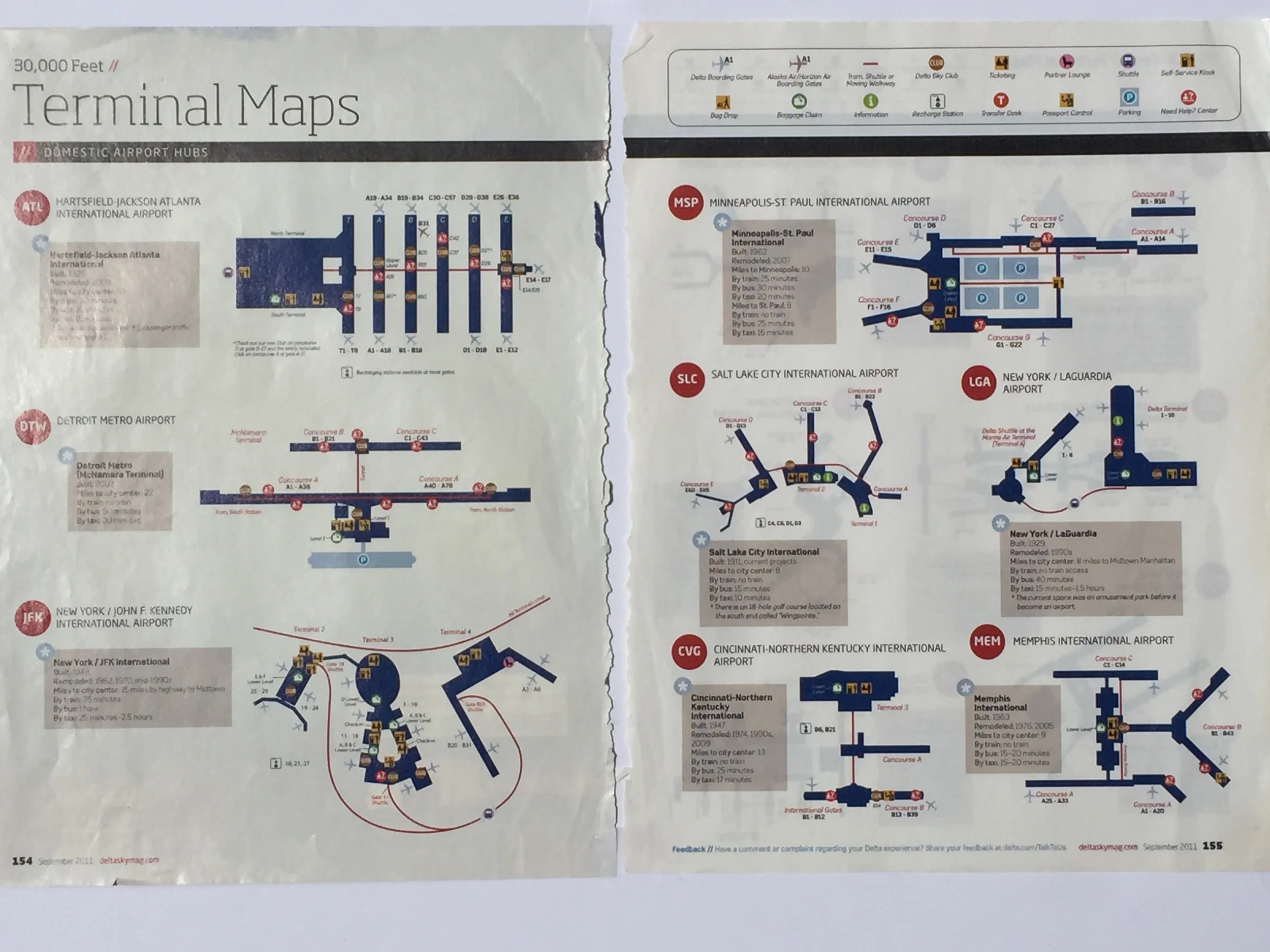
Like you, I’ve spent countless hours on planes, going back and forth to conferences and business meetings, as well as for leisure travel (albeit only very occasionally in Business Class). And I was always drawn to those pages at the back of the inflight magazines where they showed you all the terminals that the airline you were flying could possibly land at. Or rather, the selective parts of the terminals each particular airline cared about, and therefore bothered to illustrate.
And I would tear them out.
Terminal maps from Delta's Sky inflight magazine.
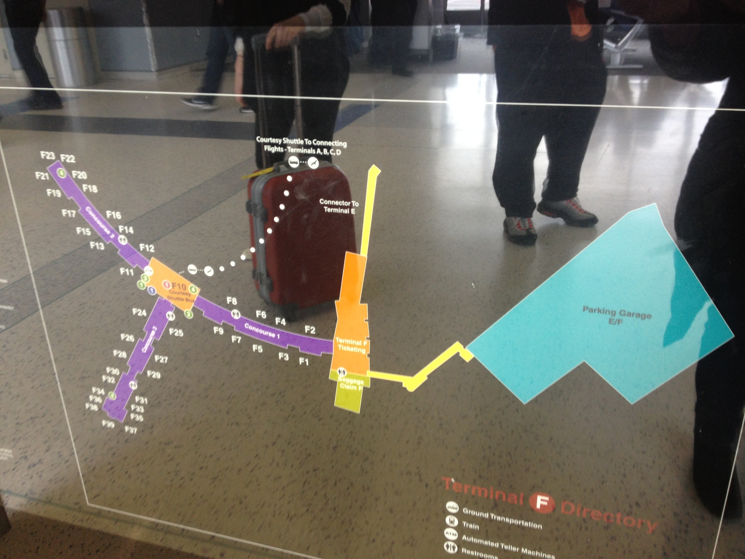
Lugging my carry-on up endless miles of corridors, I would stop and block traffic for a few moments, to snap photos of the backlit plans that show you what fast food options are available in which concourse, and where to get a ten-minute back massage, or a quick prayer.
Sometimes they even show them as part of the inflight entertainment, so I photographed those too.
AIRPORTS AND GLOBAL ECONOMICS
What struck me as fascinating, as I gathered these images, was how utterly different each airport plan was from the others. This is a building type (as architecture junkies call it) in which the function is, more or less, identical from airport to airport — to get people and freight from one place to another. But more than any other building type I could think of, airports terminals are wildly varied in their shapes. This didn't seem to be directly related to geography, available land on which to build, or surrounding topography, although these factors are obviously highly significant and influential on the form.
I knew there was a building-boom going on in this sector — major new airports are under construction all over the world. As an erstwhile architectural journalist, I remain interested in the relationship between architecture and economics. The newest airports are arising within emerging markets, particularly in South East Asia and in the Middle East. And they are physical expressions of those countries’ ambitions to compete — practically but also symbolically — in a global discourse of trade, transportation, and communication. Some of the newest ones are of dimensions that defy the imagination, but I’ll get to that in a moment.
New York Times Business Travel supplement, May 2013, on the correlation between airport construction/expansion, and emerging markets.
Advert in the London Evening Standard by the campaign for a third runway at London Heathrow, already one of the top five busiest airports in the world.
Istanbul New Airport, by Grimshaw/Haptic/Nordic Office of Architecture Image via bbc.com, The World's Most Spectacular New Airports, 1.20.2015
Mexico City International Airport, designed by Foster and Partners. Image via bbc.com, The World's Most Spectacular New Airports, 1.20.2015
Airports seemed perfect as the second case study in my series entitled “A Natural History of Technology" which explores the formal evolution of man-made artifacts as though they were specimens from nature. “Fossils of Our Time,” 2009, the first in this series, considered the evolution of the TV remote control, through plaster casts of their rubber keypads.
Janet Abrams, Fossils of Our Time, 2009. Photo: Tim Thayer.
As an artist, I wanted to examine the ‘league table’ of the world’s busiest airports, and to make scale versions that could be looked at comparatively, side by side. Not so much as a data-visualization, or a statistical analysis, or a set of pristine architectural models. But in a way that would capture something more poetic and transcendent — synoptic — about the period of history we are in, and the conditions of globe-trotting that have become so taken-for-granted. A century and a half ago, I might have focused on railway stations instead.
EUROPEAN CERAMIC WORK CENTRE = CLAY MECCA
So I applied to the European Ceramic Work Centre (then in Den Bosch) in The Netherlands… and was lucky to be chosen out of an international pool of applicants for an individual residency, allocated 18 months ahead of the actual time slot.
Courtyard of the European Ceramic Work Centre, in 2013, then based in 's-Hertogenbosch, The Netherlands. It has recently moved to Oisterwijk, NL
The EKWC (or Ay Kay Vay Say, as the Dutch pronounce its initials) is a place where artists of all kinds — ceramic afficianados or complete novices at using the material — can do a residency of three months’ duration: long enough to undertake projects of considerable complexity. There isn’t really anywhere in the US quite like it; the closest equivalent is probably the Archie Bray Foundation for the Ceramic Arts in Montana, another artist residency that focuses exclusively on clay. The technical staff at the EKWC is extremely knowledgeable, so even if you don’t have a clue how to execute your proposed project, if they accept you, it’s because they like your idea and can help you figure it out. They’ve actually just moved to new premises outside Den Bosch, in Oisterwijk, but when I was there, the Kiln Hall was a cross between the turbine room of an ocean liner and a Gothic Cathedral with half a dozen giant, digitally programmed Blaauw kilns...
Technical staff at the European Ceramic Work Centre, in its (former) 's-Hertogenbosch premises, load work by artists Simon Bedwell (L) and by Jieun Yoo (R).
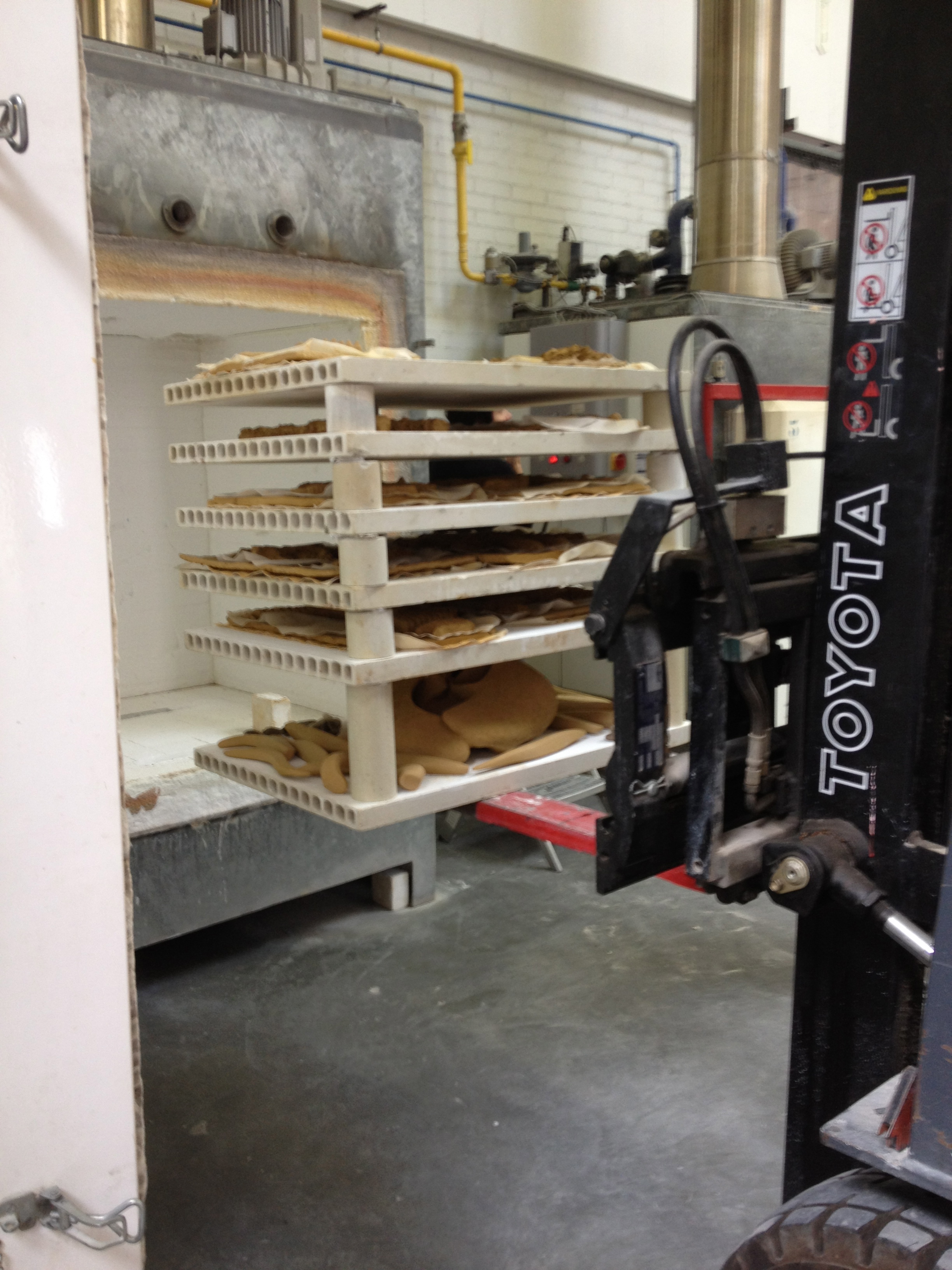
Work is loaded into the Blaauw kilns using fork lifts to set multiple tiers of shelving onto the kiln carts.
which (allegedly) are lined in the same hi-tech material that clad the Space Shuttle, and can go up to full temperature and down in a little over 24 hours. We had the same kilns at my graduate school, Cranbrook Academy of Art, where they were affectionately known as the “toaster ovens.”
The place was constantly humming; there was a revolving door of arrivals and departures of residents, so that the demand on the kilns could be managed; quite often, people are firing multiple kilns towards the end of a residency to get their work finished. That turned out to be my case, too, although I didn’t start firing until a few weeks in. You’ll see why in a moment. My next door neighbors were making, respectively, an installation of a dozen porcelain dogs standing on their back legs, and missing their front legs entirely (Birgit Saupe), and press molded giant squid (David Zink-Yi), both projects alludingto the state of nature in a time of climate change and genetic modification. My project was, by comparison, rather straightforward.
HANDS ON KEYBOARD, OR HANDS IN MUD?
When I got to the EKWC, I didn’t exactly know how I was going to fabricate the airports — or even, how many. Just that there had to be enough to form a grid, at least 3 x 3 or maybe 4 x 4, to be mounted on a wall.
Having recently audited a class about digital fabrication for artists, while working at Penn State University’s architecture school, I thought I might use the EKWC’s “Fab Lab” to make press-molds from Styrofoam blocks, using the CNC-milling machine. However, it wasn’t clear, even to the EKWC's longest serving technical staff member, Peter Oltheten, whether the narrow junctions between terminals, made in miniature in clay, would survive being pressed out of these molds without breaking.
Nonetheless, I started out spending a few miserable days trying to draw the outlines of a few key airports in Rhino software from Google Maps satellite images — almost impossible to decipher because of shadows, and the fact that, when you zoom in to capture the buildings’ actual edges, the images pixellate to useless shades of grey. I decided that I hadn’t come all the way to Europe to sit in a dark room in front of a computer, struggling with 3D software I wasn’t sufficiently skilled in.
Besides, the off-gas stink of Styrofoam being milled in the adjacent room was giving me headaches.
I wanted the humid, dank and delicious smell of clay in my nose; my hands in mud, not on a keyboard.
A lovely fresh bag of terracotta...
There were some major questions to solve:
HOW BIG DO I WANT TO MAKE THIS PIECE OVERALL?
To find out how big I could make it, I had to sketch the airports.
HOW MANY AIRPORTS would occupy what actual square footage?
The best way would be to sketch them.
But then, before I could answer those, the biggest question was:
WHICH AIRPORTS?
The cover article in the New York Times Business Travel supplement from May 2013 led me to the Airports Council International (ACI), which gathers all manner of data on airports, including passenger and freight movements, and produces rankings based on these data (which seem to be in perpetual flux, with variations between monthly and annual figures, and still more shuffling when "final" statistics are tabulated). I decided to plump for the Top 30 "League Table" for passenger traffic 2011 — the most recent available in summer 2013.
The "league table" of the world's Top 30 busiest airports: ACI rankings for 2011 by passenger traffic, which I used as the basis for In The Unlikely Event
So I went right back to the computer, powered up Google Maps, and projected satellite images of the airports, one by one, onto large swaths of kraft paper, torn off a big roll, and masking-taped to the wall of the EKWC's conference room. Lots of battles with irredeemably curly paper, and insufficiently sticky masking tape! I became quite adept at zooming and shifting the locus of the airport within the frame — one hand on the mouse, a fat black felt pen in the other — to make cartoon-like tracings of the terminals, minus their parking lots and connecting ramps/roadways in most cases.
Then I pinned them up in my studio, in no particular order, to get a visual estimate of the surface area they would occupy if built them in clay at that actual size. I carefully pinned them up so the airports would be correctly aligned to True North: something that easily gets overlooked when consulting printed terminal maps and other "outtakes" from actual geography.
First batch of projection tracings pinned up on the wall of my EKWC studio.
Airports in SE Asia — tracings at various scales. Top row, L-R: Hong Kong, Guangzhou, Beijing. Bottom row: Incheon (partial view), Jakarta, Kuala Lumpur.
Immediately I realized the huge disparity in scale of these various airport structures.
There’s a scale marker in the bottom left hand corner of each Google Maps image, and the scale changes as you zoom notch-by-notch on the vertical slider, in or out. But the scale changes in different increments, depending on which satellite imaging company provided the view, and how they shot it. It's hard to tell much about actual size just by looking at an image that happens to fit in the window of one’s laptop, within the boundaries of a Google Maps satellite image.
Reading those scale markers more closely, I quickly realized that the newer Asian airports were of a different order of magnitude than most of the airports in the West, in the US and Europe. These newer airports are designed and built ‘en masse’ as a single structure, even if made up of a few component parts; they have been built to accommodate hundreds of gates attached to a few (often highly symmetrical) major forms, serving gigantic airplanes. In the West, many airports of an older generation are now a hodge-podge of small terminals sprouting from the original primary architectural units, which have become a bit like barnacled sea-creatures.
Looking at some of these new Asian airports, I couldn’t help thinking that their architects and developers were trying to create a ‘logo’ for the cities to which they're connected, and whose urban scale they dramatically exceed. To whom are these giant emblems, visible far out in space, addressed: passing Martians? Some of these airports remind me of Mayan Ball Fields, so epic are they in their scale. Perhaps in centuries to come, they'll be relics of just that sort, large scars or patterns, or cattle brands on the rump of the earth.
A SIDEBAR ON SCALE
In 1977, the American designers Charles and Ray Eames made a short film, called Powers of Ten, in collaboration with physicist Philip Morrison, to present at a conference of physicists. It demonstrates the idea of exponential growth, in distance, as the camera zooms progressively outward from a picnic cloth on the shores of Lake Michigan, by a factor of ten, until the view of the earth recedes and one is far out in the distant reaches of the universe. This film has been enormously influential, and is a cult movie among designers, but the experience is now readily available to anyone using Google Maps and Google Earth — albeit only to a certain distance from earth rather than 10 to the 32nd away.
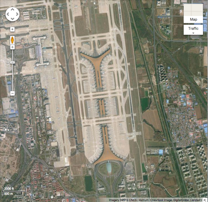
Pay attention to the grain of the neighboring urban structures as they come into view the more I zoom into toward Beijing airport, designed by the British architecture firm Foster and Partners. As air passengers, we don’t often get this "god’s eye view" of an airport, unless sitting in a window seat with a propitious angle of descent; it’s more the pilot’s privilege.
Beijing airport at 2 miles/5 km scale view
Beijing at 2 miles/2 kilometers scale view
Beijing airport at 1 mile/1 kilometer scale view
Beijing airport, 2000 ft/500 m scale view
Beijing airport at 1000 ft/200 m scale view
THE WORK BEGINS IN EARNEST
At this point I had a wild array of airport designs, drawn at varied scales. Upstairs to the conference room I repaired once again, to redraw the lot, but this time with a home-made scale bar of 10 cm = 1000 ft (yes, a mix of metric and imperial but so what!) Since the EKWC's projector was fixed to the ceiling, I had no choice but to move the wall — or rather, to project onto an available flip-chart stand, lugging this cumbersome piece of furniture a few inches forward/back, and precariously propping it up till the 1000 feet bar on the Google map matched my hand-crafted measurement. There was something satisfyingly loony about the combination of high technology imaging and my Rube Goldberg modification thereof.
Satellite imaging sophistication meets Rube Goldberg focal length modification...
By moving a flip chart stand a few inches back or forth, I could overcome the fixity of a ceiling-mounted projector and adjust the focal length manually.
Early on in the residency, in frustration at the digital fabrication process, one morning I simply laid a sheet of clear plastic over one of my tracings, and began to apply dollops of clay, clawed off the fresh chunk, filling in the outlines without much heed to accuracy. I liked what I saw: a kind of cartoon-like form, akin to the tracings. As soon as I’d made this first one (which happened to be Changi) I knew it was how I'd make them all, so long as the clay held together during drying and bisque firing, since this wasn’t exactly a tried and tested hand-building method.
The technical staff advised me to create a multi-layered 'bed' for each airport, made of different materials, to give them the best chance of surviving with all their little bits — my versions of the gates, for example — staying put rather than drying too fast and breaking off. Each piece would sit directly on a layer of ‘visseline’ (dressmaker's interfacing material) that burns out in the bisque firing. After a few trial runs, I figured out I could trace the terminal plans directly onto this sacrificial layer from the brown paper drawings, using an intermediate layer of plastic sheeting to protect the latter from felt pen smudges. Then I built directly onto the visseline. For each one, I had to roll out a “shrink slab” — a flat plate of the same clay body as the final piece, which mitigates changes in temperature (during firing and cooling) between the piece and the kiln shelf.
Miami International (MIA), left, and Hong Kong (HKG), right, traced onto visseline and ready to be hand-built
Hong Kong airport under construction: in this version, I reproduced the ribbed roof pattern of the actual airport, visible in the Google Maps satellite view. But later on, I decided that it was too 'literal' (architectural model-like) and less interesting than the rougher-textured airports, so I remade it.
Changi (left), Istanbul (rear right), and Sao Paolo (lower right) rub shoulders on a kiln shelf...
SFO International, and a printout of the PDF of this airport from Flightstats.com which I consulted as a reference for the terminal plans while hand building.
My tracing of FRA (Frankfurt International) with its Flightstats.com PDF equivalent, for comparison
I downloaded PDFs of the airport terminals from flightstats.com because the satellite images weren’t always easy to decipher, on account of shadows or occasional errors in the images. These simplified plans were extremely helpful [though alas they seem no longer to be freely available on that site].
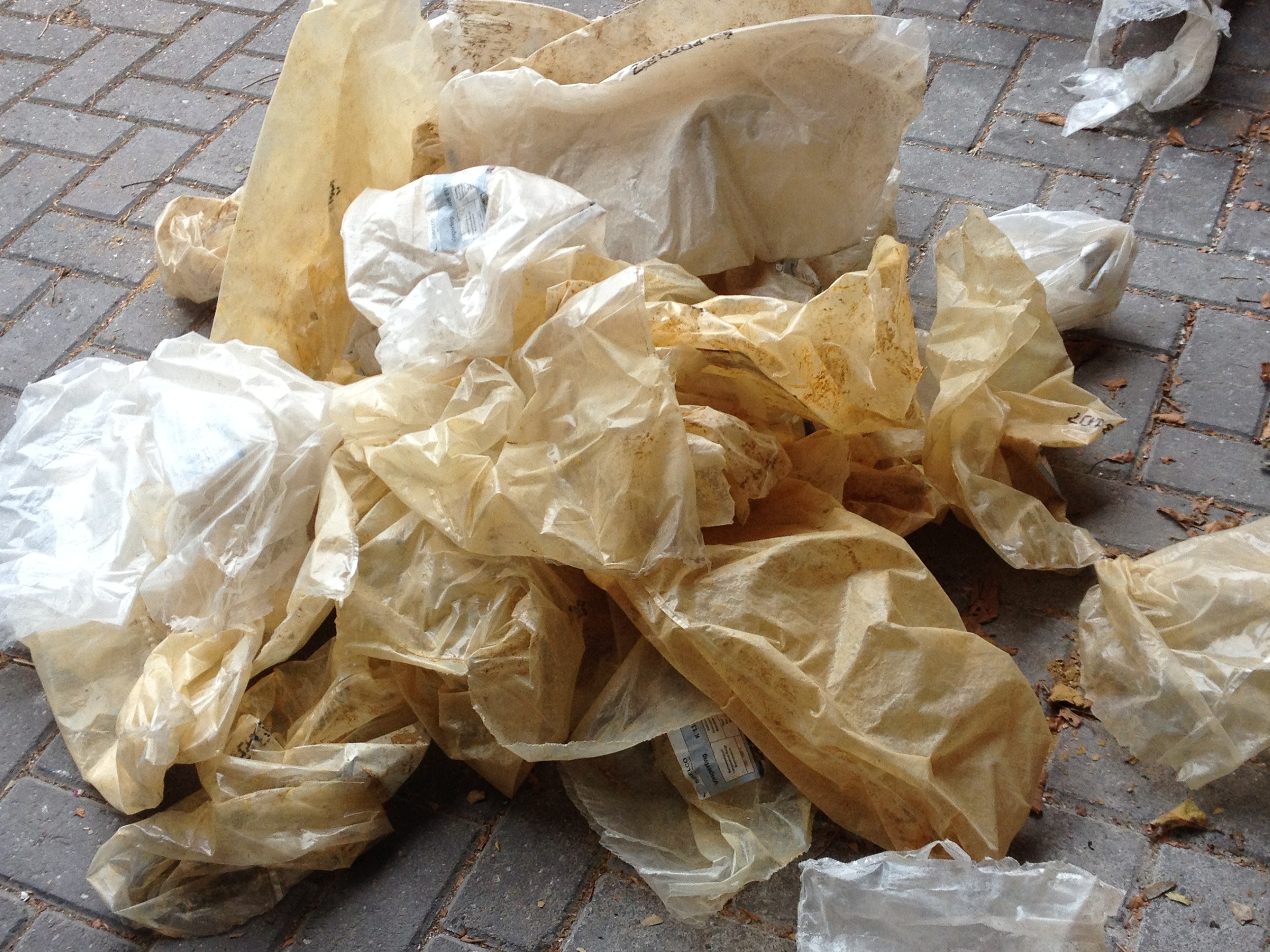
When I'd finished building each airport, it was stowed on a cart enclosed in plastic sheeting, to protect it from breezes/temperature gradients during the drying phase, which took several weeks. The first batch was started in late June 2013, and I'd made about a dozen airports by the end of July, when my fellow Residents and the EKWC technical staff came by for a 'Studio Visit/Review' in which many helpful comments were offered, regarding both technical and conceptual aspects of the project in progress.
Airports "lying in state" under blue plastic, allowing for smooth drying...
The first batch was then ready for bisque firing, and several kiln shelves at a time were loaded — with much assistance from EKWC staff and intern Jon Geiger — into the kiln, using a fork-lift.
Peter and Marianne from the EKWC's technical staff, assisted by summer 2013 intern Jon Geiger, take the airports off the drying rack to load for bisque firing
EKWC Intern Jon Geiger practises maneovering the fork lift to load my airports into one of the Blaauw kilns for bisque firing.
Marianne Peijneberg advises Jon Geiger as he aligns the fork lift to load the stack of kiln shelves into the Blaauw, with just millimeters of leeway either side
Careful now! Marianne gives Jon guidance, as he loads the stack of kiln shelves into the kiln
Airports (and a few other sculptures) ahoy!
A QUESTION OF COLOR
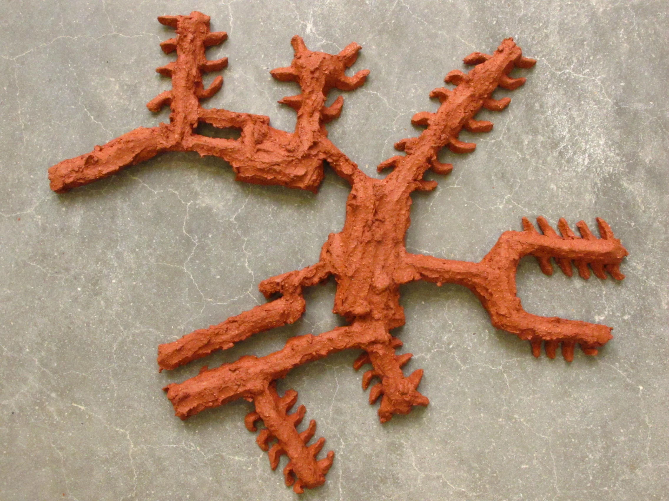
And out they came, after bisque-firing: bright orange. Problem was, I didn’t want them to look like 'chicken bricks’ or tourist souvenirs. They needed to be distanced both from the customary connotations of terra cotta, and also from the architecture they directly reference. In consultation with the EKWC staff, I chose to use terra sigillata (a liquid formula made from the same clay) as the surface finish, rather than a glaze that would smother the pieces and obscure all my finger marks. Next, I did test-firings of a few pieces (an early version of Jakarta came in handy) to see what temperature would produce what shade of red.
First version of Jakarta, used for two different test-firings — the darker shade, below, resulting from a higher firing temperature.
I used first-round versions of Changi, Jakarta and Kuala Lumpur as surface treatment tests: in the image below, the two pieces in light orange (comprising Kuala Lumpur) show the basic color after bisque firing.
Terracotta in its several shades, from the yellow of the raw unfired clay (dried chunks, top right), to the dark red of Changi airport, the largest item shown.
(The dark brown pieces, lower right, are maquettes unrelated to the ITUE project.)
Beijing (above) and Charles de Gaulle become kiln bedfellows
The second major kiln firing included some greenware (pieces not yet bisque-fired) and also some of the first batch of airports that I’d already fired with the terra sigillata coating, but to the lower temperature (so not yet as dark red as I wanted them).
Multi-level kiln load, including the second major round of airports, and on the lower shelves, some sculptures I'd made by tensioning clay-soaked jute fabric.
Blaauw kiln control panel, showing temperature reached.
And out they came, the second big batch. For one horrible moment, I thought they'd adhered themselves to their shrink slabs. Ugh, the whole lot useless. But...no, with a single tap of a chisel, off they came. Phew.
There was an ungodly (but satisfying) mess in my studio, once the airports were all gone to the kilns.
The aftermath in my EKWC studio!
I went through 400 kilos of clay in three months, on building the airports and several other sculptures.
For my Final Presentation, I simply used the floor of my EKWC studio as the presentation surface (there being insufficient time to make individual wood brackets for each individual piece, to make a wall-mounted presentation). The 30 airports took up an area of 9 feet by 25 feet, when laid out with correct spacing between terminals, and each airport far apart enough from its neighbors to be legible.
Partial view of the entire set of 30 airports — aligned to True North, and individual terminals correctly spaced — on my EKWC studio floor, September 2013
I like to ask people to guess what they are, before I tell them, and keep a running list of their responses:
• "amoeba"
• "sea urchin"
• "pictogram"
• "hobbit home"
• "head dresses"
• "treelike" (re MIA)
• "streets…a neighborhood"
• "a Stonehenge sort of essence"
• "cowboy spurs" (re Jakarta CGK)
• "astrology sign from another planet"
• "robot with chainsaw for arms" (re CAN)
• "traffic circle with places where people live" (re MIA)
• "farm implement where the center part has fallen out"
• "small animals from Fukushima that were affected by radiation"
• "amazingly self-centered fish…a bit crablike” (re Guangzhou CAN)
• "worms that got dissected into multiple parts and grew tentacles"
• "neolithic space probe: if Stone Age people had wanted to send something to Mars, this is what they would have sent."
To my mind they recall Hobo icons — which is appropriate, given their subject, of global nomadism:
In August 2013, while making ITUE, I saw a beautiful piece in the Nouvelle Vague exhibition at the Palais de Tokyo in Paris, made of children’s 12 inch wooden school rulers, which seemed kindred to In The Unlikely Event. Alas, for all my online searching, I've not been able to identify the name of the artist, or its title.
Artwork seen in Nouvelle Vague exhibit at Palais de Tokyo, Paris, in August 2013. If you are the artist, please email me so I can credit you properly!
Close up of the piece seen in Nouvelle Vague, Palais de Tokyo, Paris, August, 2013
ITUE also suggests a distributed “World’s Fair” — albeit, one composed of buildings gathered from all over the world, rather than adjacent country pavilions within a World's Fair fairground. After I'd made it, I recalled my closing remark in my 2002 essay “Wherever. Your Final Destination. Maybe.” Gathered together on my EKWC studio shelves, awaiting packing for shipment to the U.S., the random assortment of airports certainly looked like some kind of plant matter, or patterns of organic growth.
After much wee-hours wire-cutting to create customized silhouettes of each airport, sandwiched between sheets of Styrofoam to protect them in transport, they were crated for shipping across the ocean...
In The Unlikely Event is the largest project I’ve made in ceramics to date. Mostly, I make one-off abstract ceramic sculptures whose forms, I am starting to recognize, are often hybrids of "found" forms (man-made objects, mechanisms, everyday consumer artifacts) and organic forms, shapes and textures seen in nature...all filtered through my deep subconscious.
SOME FINAL THOUGHTS
One of the things about making art is that it takes sheer time. And it always seems to take MORE time than you can possible anticipate. There’s a meditative quality to producing a piece such as ITUE, which entail a certain repetition in the making. Though each airport plan was different, the process of building up the bas reliefs, to about 3cm depth, was essentially the same.
So I had a lot of time to think about issues of scale and miniaturization; about what it’s like to be a passenger walking through these vast structures, as opposed to viewing them from the air — and how disorienting most airports are to their passengers [the subject of a 2016 New York Times article] though maybe less so to the professionals who work in them every day, to whom these vast, sealed spaces must be more comprehensible. As I fabricated these airports at much-reduced scale, pinch by pinch of clay, I became like Gulliver in Lilliput.
During and after making ITUE, I found myself at airports on this Top 30 list and could recognize where I was on plan because I'd made it out of clay. My first trip to DFW came after producing ITUE, but I could immediately tell where I was, riding around on the people-mover, between those vast semicircles. On a trip to London, I was flying out of Amsterdam Schiphol, and heard an announcement that a certain flight to Heathrow had a gate change. Amid the ambient hubbub, the flight number was inaudible, but I knew that I was at the apex of the “tuning fork" (see below) and that my gate was at the far end of one of the tines. But which one?
AMS Schiphol, showing the 'tuning fork' shape of two of the concourses
If it was indeed my flight that was being moved to the end of the other tine, fat chance I'd get there in time.
Mercifully, they called out a second announcement, and this time I could make out the flight number. Phew: it wasn’t mine, because otherwise I would have missed it!
